
From the beginning of Opera, in Venice, up till the early 19th Century, Ornamentation was used in opera to bring the music alive.
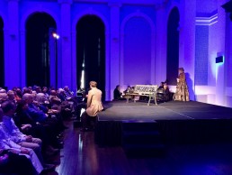
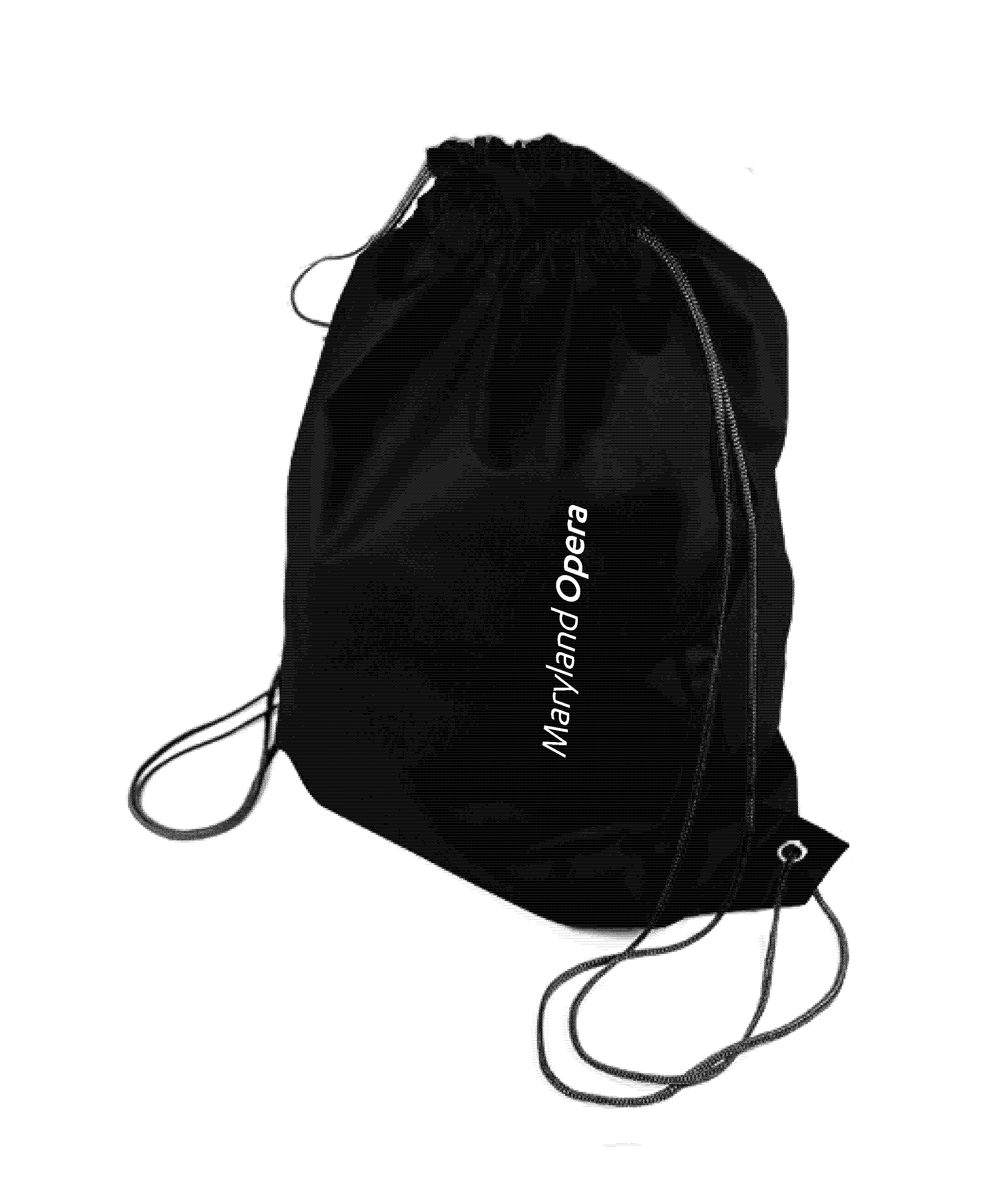
Maryland Opera is the professional opera company of Maryland. Revived from the ashes of the Baltimore Opera, which unfortunately closed in 2009 due to dwindling ticket sales and contributions, Artistic Director James Harp lead the charge to bring grand opera back to Baltimore and the whole state of Maryland in 2018. To launch the new company’s first season, in early 2019, we developed a new identity that would bring back opera on a high note.
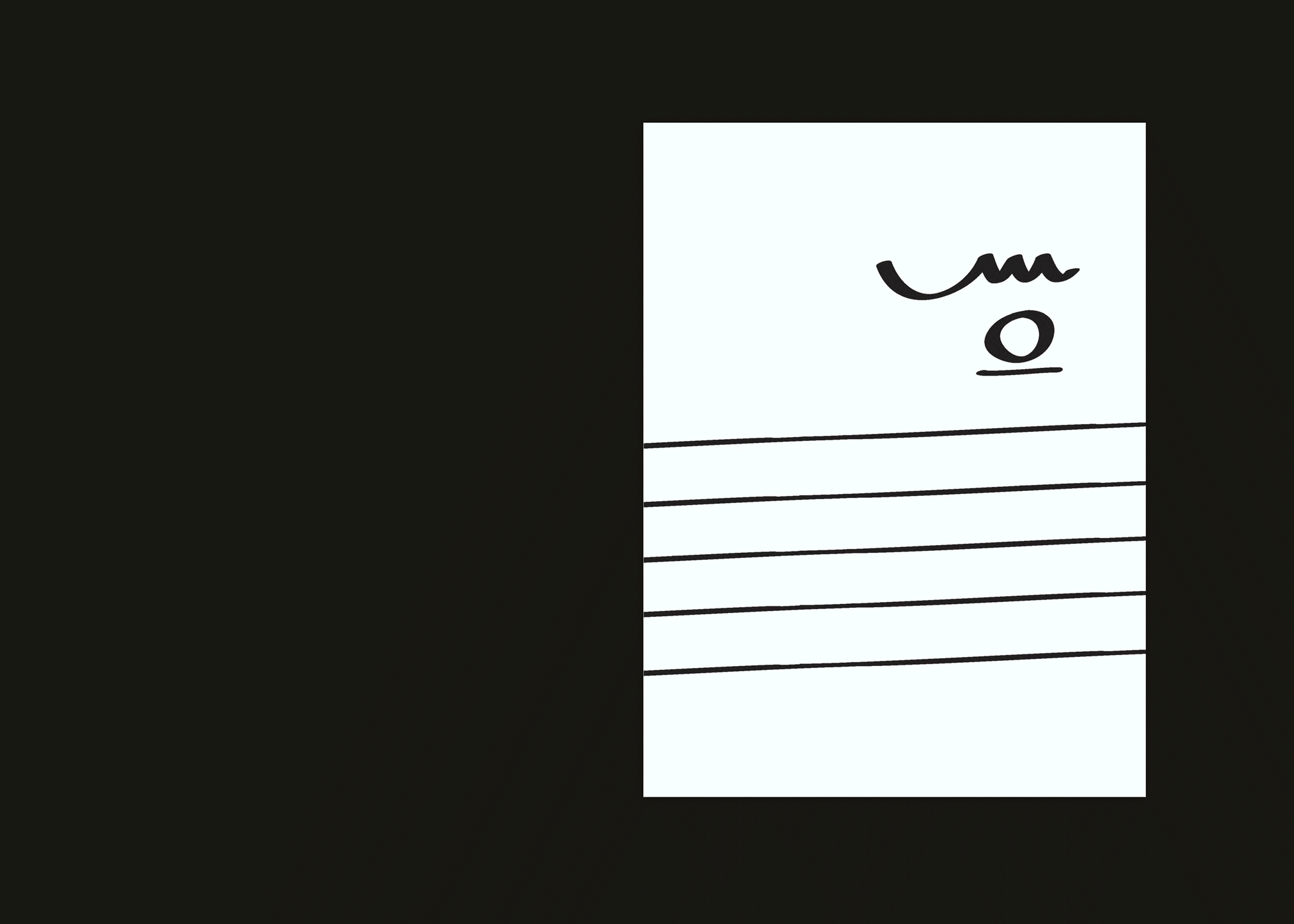
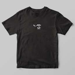
A note head with the ledger line below it indicates that it is a high B above the music staff.
The high point in an aria is often dramatically punctuated with a held high whole note that is ornamented with flourishes by the singer. Those flourishes are usually notated visually with accents to instruct the performer how to attack the note and where to place emphasis.
The high B whole note in the Maryland Opera logo symbolizes the return of opera to Baltimore. And the trill above the note creates an M which represents Maryland.
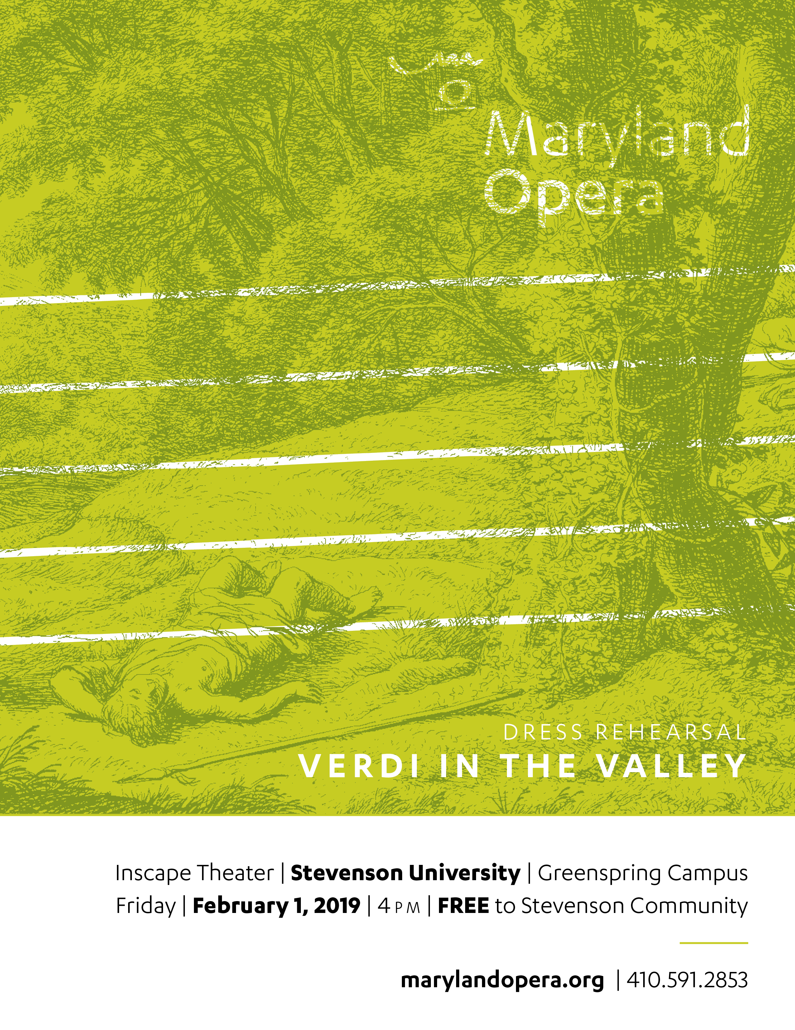
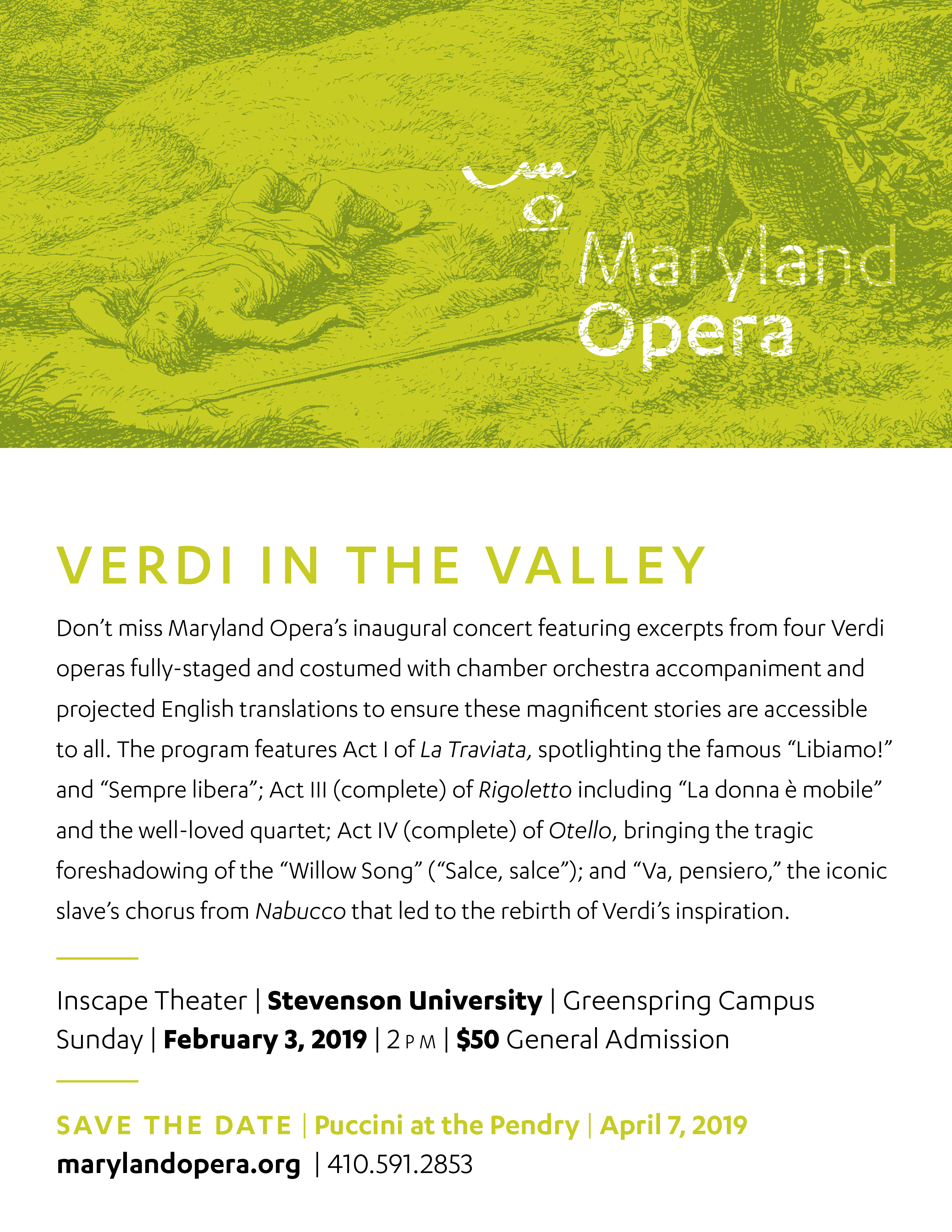
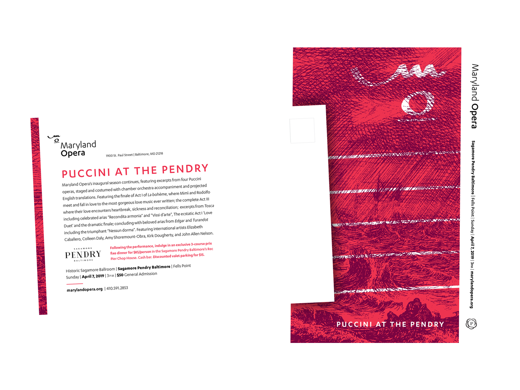
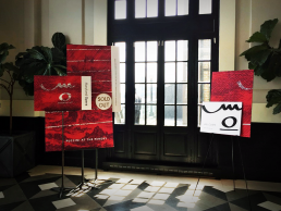
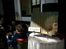
To kick off their inaugural season, we used etchings and oil paintings, from the Metropolitan Museum of Art’s archives, in a contemporary color palette and with unexpected crops to visually represent the beauty, majesty, and romance of the music that was programmed.
Loud, bold colors contrasted with elegant black and white type and logos give the campaign a crisp, elegant, and modern aesthetic.